
Auto-Cropping Rounded Corners
Auto-Cropping Rounded CornersI know, I know. What this world really needs is a new rounded corners solution. With CSS3 support right around the corner (ha, right), why bother, right?
Well, this solution offers something new to the world of rounded corners. What it does is this: it crops the content below it, so that anything with a background color or image (headers, paragraphs, even images) automatically get the rounded corner treatment with no extra work. See below:
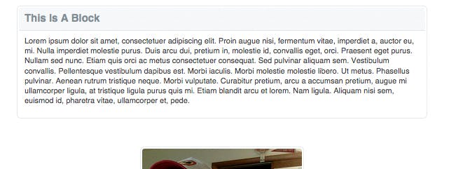
In this screenshot, the image is a normal, rectangular image. Nothing was done to it, except inserting it inside one of my rounded corners containers. It's easy enough that you can even have your clients do it in their CMSs without the headache of trying to teach them to use the Rounded Rectangle Tool in Photoshop.
This technique solves a very specific issue. There are plenty of ways to render rounded corners that involve less markup, simpler CSS, and less time in photoshop, but none of them (that I am aware of) crop the content below it.
You can view the solution at work here , and I'll try to take you through how it works.
First, The Images
So this part isn't too hard, as long as you can navigate your way around photoshop. Just as a note, it's definitely possible that there are better ways to go about this part in photoshop. If there are, don't hesitate to drop a line in the comments.
First things first: go and download the Super PNG plug-in for photoshop. What this plug-in does is strips out the color information that photoshop usually saves with PNGs, which will help you avoid that little difference you can see between browsers. See here for a more detailed explanation, but this is important.
Once you've got Super PNG running, use the aforementioned Rounded Rectangle Tool to create a rounded rectangle with your desired radius and give it the background color of your container. Edit the layer style to give it a stroke of whatever width you'd like, then rastersize it. Then, decide how much padding you want to be cropped inside your container (I used 2 pixels in the screenshot above). Duplicate your rectangle, and shrink it to fit inside of your desired padding. CMD/CTRL+click on the layer thumbnail to load the selection on the smaller rectangle, then select the larger rectangle and hit delete. You can now throw out the smaller rectangle.
Once this is done, you should have the outline of a container. Now, zoom in to one of the corners, and, using the marque tool, select a square that is just big enough to contain the corner. Copy it, open a new document, and paste it in. Throw out the background, if there is one, and you should have a corner that looks something like this:

Once you've got this, simply save it, then rotate it and save it three more times so that you end up with each corner.
Second, The HTML
Now that that annoying photoshop work is done, I'm going to start referring you to an actual example, located here. Here's the HTML for one box:
<div class="b_greyWhiteStroke">
  <div class="TL"></div>
  <div class="BL"></div>
  <div class="TR"></div>
  <div class="BR"></div>
  <div class="b_innerContainer">
    <h2>This Is A Block</h2>
    <p>Lorem ipsum dolor sit amet...</p>
  </div>
</div>
This is fairly simple. There's a div for the outer container, a div for the inner container, and a div for each border. All of your content will go inside .b_innerContainer, and the corners of this content will automatically be cropped.
Third, The CSS
The CSS for this solution is a little more complicated, but nothing too bad. The basic idea is that you give the border divs position:absolute, place them in the corners, and let them sit on top of everything else, thus cropping it:
.b_greyWhiteStroke {
  position: relative;
  border-color: #dce3e7;
}

.TL,
.BL,
.TR,
.BR {
  width: 6px;
  height: 6px;
  position: absolute;
  background-repeat: no-repeat;
  background-color: transparent;
  z-index: 9999 !important;
}

.TL {
  top: 0;
  left: 0;
}
.BL {
  bottom: 0;
  left: 0;
}
.TR {
  top: 0;
  right: 0;
}
.BR {
  bottom: 0;
  right: 0;
}

.b_greyWhiteStroke .TL {
  background-image: url(images/grey_whitestroke_tl.png);
}
.b_greyWhiteStroke .BL {
  background-image: url(images/grey_whitestroke_bl.png);
}
.b_greyWhiteStroke .TR {
  background-image: url(images/grey_whitestroke_tr.png);
}
.b_greyWhiteStroke .BR {
  background-image: url(images/grey_whitestroke_br.png);
}

.b_innerContainer {
  border-width: 1px;
  border-style: solid;
  padding: 2px 2px 8px;
}

.b_greyWhiteStroke .b_innerContainer {
  border-color: #dce3e7;
}
See, that's not too bad, is it? A couple notes here. First, I've separated .TR from .b_greyWhiteStroke .TR. This is so that I can have multiple background-color schemes going with only minor additions to the CSS. So, if i wanted to create, say, and alert box with a yellow border, I wouldn't have to rewrite all the existing CSS, I'd just have to make some additions.
What about ie6?
IE6, as always, was the big headache here. However, by hacking up Angus Turnbull's IE PNG Fix with a couple of my own modifications, I managed to get it to work. The problem, aside from ie6's refusal to run transparent PNGs, was that the border block wouldn't always line up with the edge of the container. I assume it's some sort of rounding error, but I'm not positive about that. Anyway, the PNG Fix now fixes the transparency, and checks to make sure the borders are where they should be. The only problem here is that this solution doesn't work in ie6 when you use a fluid width. Or, more correctly, it will correct itself when the page loads, but there is a possibility of the borders moving a pixel out of place if user starts manually changing the width of the window. Check out the example page in ie6 to see what i mean. Here is the code to include this fix:
<!--[if lte IE 6]>
  <style type="text/css">
    .TL,
    .BL,
    .TR,
    .BR {
      overflow: hidden;
      behavior: url('ie6fixborders.htc');
    }
  </style>
<![endif]-->
The End
So, there you have it. You can download the entire example here . This solution, for sure, is not the best for all situations. There are tons of smaller and easier solutions out there, and you should use them unless you have this specific need. However, if you do decide you need something like this, I think you'll find it to your liking.
As always, I'm more than open for comments and suggestions for improvement. Hopefully you'll find this solution useful sometime in the future.
Comments (archived for posterity)
- Brad Dielman commented
Nice technique Dan. I’m going to try it myself!
Good to see you posting again. ;)
- Benjamin Doherty commented
If that’s the kind of excessive markup needed to create rounded corners, I say “hooray for right angles.” What a nightmare. If you must use rounded corners, use jQuery to add that after the page is loaded.
- Dan commented
@Benjamin -
I agree, it’s a lot of markup. Remember, though, it’s not just creating plain old rounded corners; these corners do a specific job that other solutions don’t, so you sacrifice code brevity for the advantages stated above. Also, many times in the professional world, it’s unfortunately not a possibility to just drop the rounded corners from a design.
Using jQuery is of course always an option, but if you end up having a bunch of these containers on one page, you can run the risk of having users notice a delay. I’ll have to look into that some more.
Either way, thanks for stopping by.
- Links of Interest - CSS-Tricks commented
[...] T Ott has a pretty slick example up on how to add auto-cropping rounded corners. This means you can use any regular rectangular photo and apply a rounded corner look with just [...]
- Skylog » Blog Archive » links commented
[...] Auto-Cropping Rounded Corners (tags: css) [...]
- Recortador de imágenes redonde commented
[...] donde se explica como hacer un generador de imágenes redondeadas con CSS. Eso sí, luego vas a tener que hacer que funcionen las transparencias de PNG en IE6. [...]
- Matthew Hill commented
I think those extra elements for creating a rounded corners effect is overkill, although I do like the benefit of your cropping technique. I’m confused about your comment on training people using CMSs though: No client I know would tolerate having to write all that HTML for a simple graphical effect! You must have some very easy going clients. ;-)
I think the extra HTML elements might be tolerable if they are just used once or twice on a page, but if you are using this technique for a lot of images, I’d have to agree with Benjamin that manipulating the DOM would be better. Although, you would probably have to do some some speed testing to see if a larger HTML file to download is quicker than manipulating the DOM after the the page has loaded—and whether or not the visual change is too noticeable.
I guess at the end of the day it all depends on how important the rounded corners are to the design. If they are just ‘nice to haves’, I think the DOM method would be best.
- Dan commented
@Matthew - I wasn’t referring to making clients write html. Instead, when setting up a CMS like Wordpress, for example, you could code this solution into the sidebar, and then your clients could stick whatever content they wanted in there and still have the corners of their content rounded automatically.
- Eric Meyer commented
I did something very, very similar for Technorati (which is a couple of designs past that one) a few years back, but with three differences. One’s minor, the second notable, and the third structural.
The minor one: I used
bs instead ofdivs.The notable one: I used one background image, not four.
The structural one: no “b_innerContainer” or other interior-wrapping
div; just the element to be cornered and thebs to define the corners.In exchange, the CSS was a little more complicated than yours, though not by much.
So, given those clues, can you work out how I did it? I promise to share the answer if nobody does (ping me by mail if needed).
- Dan commented
@Eric - Thanks for stopping by. As far as using one image, my original version of this did, but i couldn’t get the ie6 transparent png filter to work with background-position, so i abandoned that (sadly) and moved to four images. If you know of a way to get that to work, i’d love to know.
As far as removing the inner container…you; could probably set all of the positioning values to -1px and it would overlap the outer container borders. That indeed would make things more simple.
Perhaps I’ll do some more testing and update this solution to reflect those changes. It would be nice to cut it down a little. Plus, who doesn’t love a CSS puzzle? (;
- Ralph commented
Thank you for your idea and i will testing in my next days for my own websides.
Ralph
- Eric Meyer commented
Correct about the -1px solution! And yeah, the difference with the background image(s) is that I was using GIF89a instead of PNG, so I didn’t have to deploy any fixes for IE6. The various IE6 PNGfixes, like Angus’, kill ‘background-position’ values, which in turn kill the ability to use a single image.
I never did get around to writing up how I did my solution. Maybe we should do it jointly. I think a useful update would be to use CSS hacks (or a conditionally commented IE6-only stylesheet) to feed the sliced-up and fixed PNGs to IE6, while letting everyone else use a single PNG.
Of course, if IE8 supports rounded corners, the impetus for using this kind of solution will diminish, but it could still be very useful for the next couple of years.
So whaddya think? Should we write it up, maybe submit it to A List Apart?
- Dan commented
@Eric -
Re the write-up, I’d for sure be all for doing a joint article; for ALA or otherwise…I; think that’d be great fun.Re what to do about ie6, it’s always a toss up, isn’t it? One nice thing about going the direction you suggested is that we could use that chance to apply the css filter (for PNG-type transparency) manually, and throw out the script. I’ve already noticed delays running that script through each corner in ie6, so maybe that’d be the way to go. It also would make me feel a lot better to have just one image loading normally.
Anyway, maybe drop me an email (dan at this site) and we can talk about things some more.
- Matt Hobbs commented
@Eric: I attended a workshop of yours in London a couple of years back, i still use the method you describe for rounded corners, which is the one you have mentioned (i assume it is still the same one and hasn’t been modified). Having 1 image for all corners is great, and the slight added markup is fine 99% of the time.
I have to admit i didn’t even think of adding the corner markup using JS (been a little slow there, oops!). Using jQuerys $(document).ready() method would be perfect as users won’t see the corners flash into place. May just have to add a quick plug-in to do it as i seem to be using the method a few times a month.
Great article!
- Using CSS to Do Anything: 50+ commented
[...] 3 Simple Steps in Coding a Rounded Corners Layout- A new solution for rounded corners, what it does is: it crops the content below it, so that anything with a background color or image (headers, paragraphs, even images) automatically get the rounded corner treatment with no extra work. [...]
- Using CSS to Do Anything: 50+ commented
[...] Auto-Cropping Rounded Corners- A newborn resolution for amygdaliform corners, what it does is: it crops the noesis beneath it, so that anything with a scenery colouration or ikon (headers, paragraphs, modify images) automatically intend the amygdaliform crossway communication with no player work. [...]
- zara commented
<blockquote cite=”“>
If you must use rounded corners, use jQuery to add that after the page is loaded.
</blockquote>the curvycorners-plugin does not work with “position:fixed”, you need to do it on your own…
zara
- Recent Links Tagged With "roun commented
[...] Mon 01-12-2008 Easy Rounded Corners with Border-Radius Saved by govardhanks on Tue 18-11-2008 Auto-Cropping Rounded? Corners » {Daniel T Ott} Saved by virreerriv on Tue 11-11-2008 How to Make Rounded Rectangle Round, Illustrator [Free [...]
- » 50???????CSS????? commented
[...] DemoView it Here Auto-Cropping Rounded Corners- ???????????????, [...]
- Using CSS to Do Anything: 50+ commented
[...] Auto-Cropping Rounded Corners- A new solution for rounded corners, what it does is: it crops the content below it, so that anything with a background color or image (headers, paragraphs, even images) automatically get the rounded corner treatment with no extra work. [...]
- 50???????CSS????? | ?? commented
[...] DemoView it Here Auto-Cropping Rounded Corners- ???????????????, [...]